4 Model Diagnostics
4.1 Basic Diagnostic Tools
A few standard graphical tools and summaries can greatly help to understand a dataset and evaluate the quality of a proposed model. For example, the HSB2.csv dataset contains 600 observations from a very large study of students in the U.S. carried out in 1980 by the National Center for Education in Statistics. Some of the variables in the dataset are:
gender: Gender asmaleorfemale1.lang: First language, with levelsenglish,spanish,mandarin.minor: Identify as an ethnic minorityyesorno.ses: Socio-economic status, with levelslow,middle,high.sch: High school type, with levelspublic,private.locus: Locus of control, a continuous covariate indicating the subject’s self-perceived degree of control over the events which affect them (higher = more perceived control).concept: Self-concept, a continuous covariate reflecting the subject’s self-perceived academic abilities (higher = more self-perceived ability).mot: Motivation, a continuous covariate (higher = more self-perceived motivation).math: Standardized math test scores.read: Standardized reading test scores.
4.1.1 Exploratory Diagnostics
Prior to jumping right in with model fitting, it’s a good idea to get a basic sense of the variables in the dataset. One such exploratory diagnostic tool is the \(\R\) summary() command:
# variable summaries: just look at a few variable here to save space
summary(hsb[c("gender", "lang", "mot", "math")])
## gender lang mot math
## Length:600 Length:600 Min. :0.0000 Min. :31.80
## Class :character Class :character 1st Qu.:0.3300 1st Qu.:44.50
## Mode :character Mode :character Median :0.6700 Median :51.30
## Mean :0.6608 Mean :51.85
## 3rd Qu.:1.0000 3rd Qu.:58.38
## Max. :1.0000 Max. :75.50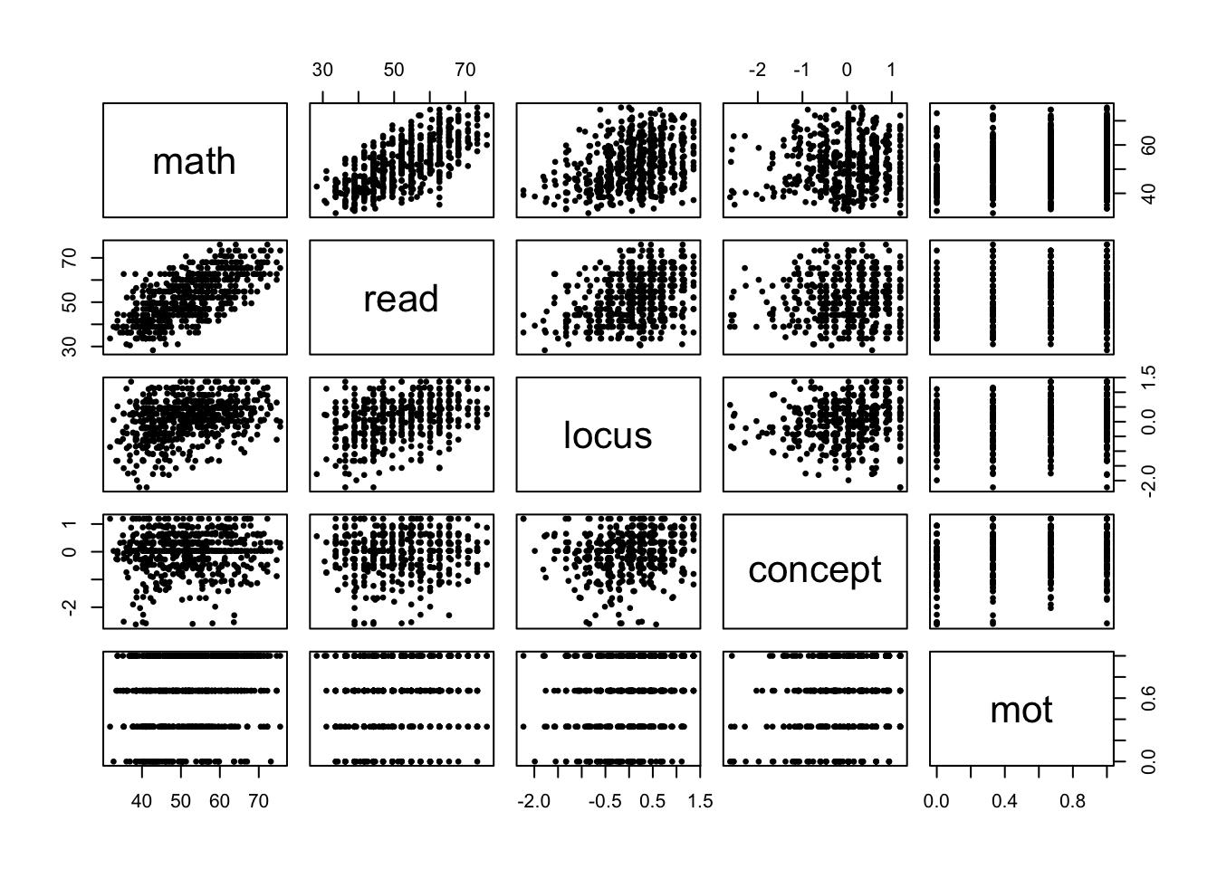
Figure 4.1: Pair plots for all continuous variables in the dataset.
Summaries like this are useful to get a sense of the range for continuous variables, and the totals per category for categorical ones. In this case, we can see that only 34 out of 600 students speak Mandarin as a first language. Thus, it may be somewhat far-fetched later on to make statements about the difference between Mandarin and other first-language speakers in our analysis. Typically in such a case we have the following options:
- Clearly state that our statements regarding Mandarin speakers are based on a very small sample size, so more data is required to properly support them.
- Convert
langinto a binary categorical for whether the first language is English or not. Now we have 495/105 speakers in each group. - Exclude the Mandarin speakers from the data set, clearly stating that this is on the grounds that we do not have a large enough sample size to draw conclusions for this segment of the population.
Another preliminary assessment of the data is to look at the scatter plot of each pair of continuous variables together, which we can do with the pairs() command:
# pair plots: here do it for just the continuous variables
pairs(~ math + read + locus + concept + mot,
      pch = 16, cex = .7, data = hsb)
Here are a couple of things revealed by the pair plots in Figure 4.1:
- While
motis a continuous variable, it only takes on four categories. This is most likely because students were asked to evaluate their self-motivation on a 4-point scale, which was then encoded as 0, .33, .66, and 1. So, perhaps it would be better to treatmotas a categorical variable. - Similarly, the presence of vertical line with jitter in the
conceptvariable typically means that respondents were asked several ordinal questions relating toconcept(ie., with answers “strongly disagree”, “disagree”, “agree”, “strongly agree”), which where then encoded numerically as above and then averaged together. - Clearly, the strongest association between
mathand any of the continuous predictors is withread, suggesting that students who study more are likely to get better scores in each test subject.
4.1.2 Goodness-of-Fit Diagnostics
The next part of the analysis typically envolves fitting several models until we arrive at a satisfactory one. We shall discuss model selection in depth in the following Module, but for now let’s assume we’ve settled on model M1 below.
##
## Call:
## lm(formula = math ~ read + locus + lang + minor + ses, data = hsb)
##
## Coefficients:
##  (Intercept)          read         locus  langmandarin   langspanish
##      25.4364        0.5339        1.3082        7.7982        0.7201
##     minoryes        seslow     sesmiddle
##      -3.5562       -2.4732       -0.8268
The following code checks that none of the other variables in the dataset are significant in the presence of those in M1:
## Analysis of Variance Table
##
## Model 1: math ~ read + locus + lang + minor + ses
## Model 2: math ~ gender + lang + minor + ses + sch + locus + concept +
##     mot + read
##   Res.Df   RSS Df Sum of Sq      F Pr(>F)
## 1    592 25904
## 2    588 25698  4    206.32 1.1803 0.3183
Indeed, the code tests the null hypothesis \[ H_0: \beta_{\mtt{gender}} = \beta_{\mtt{sch}} = \beta_{\mtt{mot}} = \beta_{\mtt{concept}} = 0 \] using the same multiple hypothesis testing logic and \(F\)-test as we used for categorical variables.
4.1.2.1 Residuals vs Fitted Values
Now that we have a candidate model M1, prior to any subsequent analyses, the next step is to check whether it violates any of the assumptions of the linear model. There are two standard plots to do this. The first is to plot the residuals \(e_i = y_i - x_i' \hat \beta\) as a function of the predicted values \(\hat y_i = x_i' \hat \beta\). There a couple of different residuals that we may wish to consider:
Ordinary residuals: \(e_i = y_i - x_i'\hat \beta\). There residuals have the same units as the response variable.
Standardized residuals: \(r_i = \displaystyle \frac{e_i}{\hat \sigma}\). These residuals are in units of standard deviations.
Studentized residuals: \(\tilde r_i = \displaystyle \frac{e_i}{\hat \sigma\sqrt{1-h_{i}}}\), where \(h_{i} = x_i'\ixtx x_i\) are the diagonal elements of the “Hat” matrix \(H = X\ixtx X'\). We can chose to standardize these residuals by \(\hat \sigma\) or not on the basis of which units we want for the plots, but the reason for dividing by \(\sqrt{1-h_i}\) is as follows. Recall that if all the model assumptions are correct, the ordinarly residuals are jointly normal with \[ e\sim \N\Big(0, \sigma^2[I-H]\Big) \qquad \implies \qquad e_i \sim \N\big(0, \sigma^2(1-h_i)\big) \] In other words, the ordinary residuals are normal with common mean but different variances. Thus, if we plot their histogram there’s not reason for it to look normal. An extreme example is given below, where half the variables are iid \(\N(0, 1)\) and the other half are \(\N(0, 25)\):
n <- 1e5 # sample size
sig <- sample(c(1, 5), n, replace = TRUE) # standard deviation
z <- rnorm(n, sd = sig) # random variables
z <- (z - mean(z))/sd(z) # standardize to have mean 0 and variance 1
par(mar = c(3,4,0,0))
hist(z, breaks = 100, freq = FALSE, xlab = "", main = "")
curve(dnorm, add = TRUE, col = "red")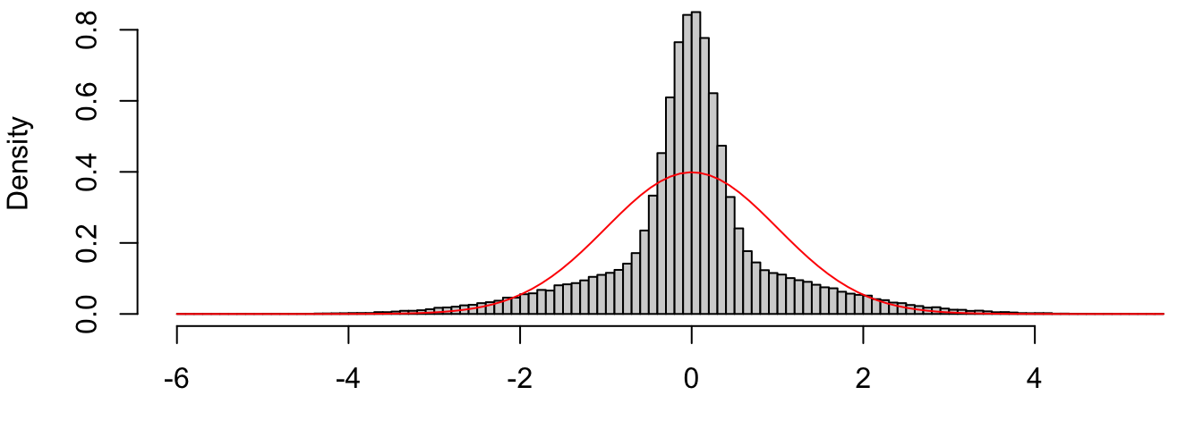
Figure 4.2: Histogram of independent normals with different variances.
On the other hand, we have \[ e_i/\sqrt{1-h_i} \sim \N(0, \sigma^2), \] such that the studentized residuals are more likely than the standardized ones to be approximately \(\N(0,1)\) if the model is true.
Figure 4.3 plots the residuals against the fitted values for M1 using both the usual residuals and the corresponding-units version of the studentized residuals, \(e_i/\sqrt{1-h_i}\). I personally like to plot the residuals on the data scale so that I can interpret the units of the \(y\)-axis as units of the response variable. Other statisticians prefer to plot the residuals on a standardized scale (dividing by \(\hat \sigma\)) so that the units on the \(y\)-axis have the same interpretation for every residual plot.
res <- residuals(M1) # usual residuals
X <- model.matrix(M1) # design matrix
H <- X %*% solve(crossprod(X), t(X)) # Hat matrix
h <- diag(H)
range(h - hatvalues(M1)) # R way of calculating these
## [1] -5.204170e-17 1.245531e-15res.stu <- resid(M1)/sqrt(1-h) # studentized residuals, but on the data scale
cex <- .8 # controls the size of the points and labels
par(mar = c(4,4,.5,.1))
plot(predict(M1), res, pch = 21, bg = "black", cex = cex, cex.axis = cex,
xlab = "Predicted Math Scores", ylab = "Residual Math Scores")
points(predict(M1), res.stu, pch = 21, bg = "red", cex = cex)
abline(h = 0, lty = 2, col = "grey") # add horizontal line at 0
legend(x = "bottomleft", c("Residuals", "Studentized Residuals"),
pch = 21, pt.bg = c("black", "red"), pt.cex = cex, cex = cex)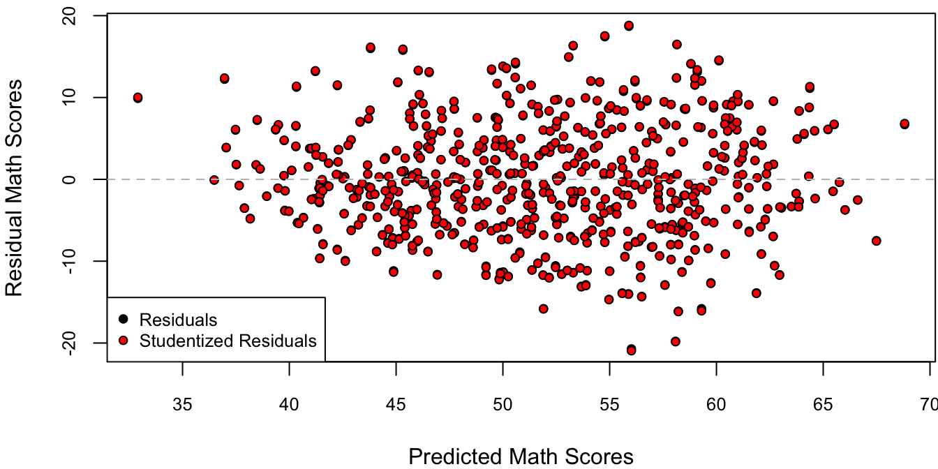
Figure 4.3: Residuals against predicted values.
Since \(\sigma^2(1-h_i)\) is a variance, we must have \((1-h_i) > 0 \implies h_i < 1 \implies (1-h_i) < 1\). Therefore, the “regular scale” studentized residuals \(e_i/\sqrt{1-h_i}\) are larger in magnitude than the original \(e_i\). Figure 4.3 illustrates that for this particular dataset and model, the difference is minuscule. However, this is not generally the case as we shall see in Section 4.3.
4.1.2.2 Residual Distribution
The residual vs. predicted value plot is typically used to detect departures from the homoscedasticity assumption, i.e., whether the error variances seem to systematically change as a function of the predicted value. This doesn’t appear to be the case in Figure 4.3. However, it looks like the residuals are slightly biased towards negative values. To see whether this is really the case, we can plot either a histogram or a QQ-plot of the residuals vs. their theoretical normal distribution, as in Figure 4.4.
# plot standardized residuals
sigma.hat <- sigma(M1)
cex <- .8
par(mfrow = c(1,2), mar = c(4,4,.1,.1))
# histogram
hist(res/sigma.hat, breaks = 50, freq = FALSE, cex.axis = cex,
     xlab = "Standardized Residual Math Scores", main = "")
curve(dnorm(x), col = "red", add = TRUE) # theoretical normal curve
# qq-plot
qqnorm(res/sigma.hat, main = "", pch = 16, cex = cex, cex.axis = cex)
abline(a = 0, b = 1, col = "red") # add 45 degree line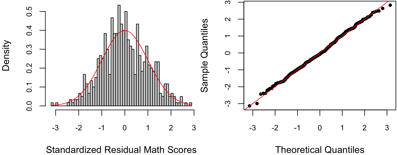
Figure 4.4: Histogram and QQ-plot of standardized residuals with theoretical normal distribution.
Figure 4.4 illustrates a basic tradeoff between histograms and QQ-plots: while the former is easier to visually interpret, it is also susceptible to the choice of bin size. In this case, it would seem that the bin size for the Histogram is a bit too small, making the residuals look a somewhat negatively biased whereas the QQ-plot does not.
For residual histograms, I personally prefer to use the standardized residuals, i.e., divide by \(\hat \sigma\). This is because I can more easily detect large residual values on the \(\N(0,1)\) (there’s a 95% chance of a standard normal being between \(\pm 2\) and a 99.7% chance of it being between \(\pm 3\)).
4.2 Colinear Predictors
Recall the satisfaction.csv dataset on patients’ self-reported satisfaction with quality of care received at a hospital as predicted by age, stress, and severity of the condition. The following are a few comparisons between potential models:
satis <- read.csv("satisfaction.csv")
# Severity in presence of Age
anova(lm(Satisfaction ~ Age, data = satis),
      lm(Satisfaction ~ Age + Severity, data = satis))
## Analysis of Variance Table
##
## Model 1: Satisfaction ~ Age
## Model 2: Satisfaction ~ Age + Severity
## Res.Df RSS Df Sum of Sq F Pr(>F)
## 1 44 5093.9
## 2 43 4613.0 1 480.92 4.4828 0.04006 *
## ---
## Signif. codes: 0 '***' 0.001 '**' 0.01 '*' 0.05 '.' 0.1 ' ' 1# Stress in presence of Age
anova(lm(Satisfaction ~ Age, data = satis),
lm(Satisfaction ~ Age + Stress, data = satis))## Analysis of Variance Table
##
## Model 1: Satisfaction ~ Age
## Model 2: Satisfaction ~ Age + Stress
## Res.Df RSS Df Sum of Sq F Pr(>F)
## 1 44 5093.9
## 2 43 4330.5 1 763.42 7.5804 0.00861 **
## ---
## Signif. codes: 0 '***' 0.001 '**' 0.01 '*' 0.05 '.' 0.1 ' ' 1# Stress in presence of Age and Severity
anova(lm(Satisfaction ~ Age + Severity, data = satis),
lm(Satisfaction ~ Age + Severity + Stress, data = satis))## Analysis of Variance Table
##
## Model 1: Satisfaction ~ Age + Severity
## Model 2: Satisfaction ~ Age + Severity + Stress
## Res.Df RSS Df Sum of Sq F Pr(>F)
## 1 43 4613.0
## 2 42 4248.8 1 364.16 3.5997 0.06468 .
## ---
## Signif. codes: 0 '***' 0.001 '**' 0.01 '*' 0.05 '.' 0.1 ' ' 1# Severity in presence of Age and Stress
anova(lm(Satisfaction ~ Age + Stress, data = satis),
lm(Satisfaction ~ Age + Severity + Stress, data = satis))## Analysis of Variance Table
##
## Model 1: Satisfaction ~ Age + Stress
## Model 2: Satisfaction ~ Age + Severity + Stress
## Res.Df RSS Df Sum of Sq F Pr(>F)
## 1 43 4330.5
## 2 42 4248.8 1 81.659 0.8072 0.3741These comparisons show that both Severity and Stress are significant predictors in the presence of only Age. However, neither is significant in the presence of Age and the other. This is because Stress and Severity are highly correlated: it seems plausible that many people at the hospital are stressed because of a severe medical condition. Based on the \(F\)-tests above, we may decide to consider the model with Age and Stress since it has a slightly more significant \(F\)-statistic than Age and Severity. However, such an approach can increase the chance of selecting an incorrect model as illustrated in the simulation experiment below.
# true model: y ~ b0 + b1*x1 + b2*x2 + epsilon
beta0 <- 1
beta1 <- 2 # x1 and x2 have very different effects
beta2 <- -2
sigma <- 1.5

# simulate data
n <- 200 # sample size

# covariate matrix
rho <- .999
varX <- rbind(c(1, rho), c(rho, 1))
colnames(varX) <- c("x1", "x2")
rownames(varX) <- colnames(varX)
varX # extremely correlated x1 and x2
## x1 x2
## x1 1.000 0.999
## x2 0.999 1.000nreps <- 10 # replicate the whole experiment nreps times
sim.out <- matrix(NA, nreps, 4) # store beta.hats and their p-values
colnames(sim.out) <- c("beta.hat1", "p-value1", "beta.hat2", "p-value2")
rownames(sim.out) <- paste0("rep", 1:nreps)
for(ii in 1:nreps) {
Z <- matrix(rnorm(n*2), n, 2) # n samples from 2 iid N(0,1)
X <- Z %*% chol(varX) # n samples from N(0, varX)
x1 <- X[,1]
x2 <- X[,2]
eps <- rnorm(n, sd = sigma) # error
y <- beta0 + beta1*x1 + beta2*x2 + eps # response
M <- lm(y ~ x1 + x2) # fit regression
beta.hat <- coef(M)[-1] # beta.hat excluding intercept
pval <- 2*pt(abs(beta.hat)/sqrt(diag(vcov(M))[-1]),
df = n-3, lower.tail = FALSE) # pvalues
sim.out[ii,] <- round(c(beta.hat[1], pval[1], beta.hat[2], pval[2]),2)
}
sim.out## beta.hat1 p-value1 beta.hat2 p-value2
## rep1 0.31 0.90 -0.23 0.93
## rep2 5.58 0.01 -5.48 0.02
## rep3 -2.60 0.34 2.62 0.34
## rep4 -1.96 0.40 1.80 0.44
## rep5 1.52 0.52 -1.40 0.56
## rep6 5.04 0.04 -5.10 0.04
## rep7 2.42 0.38 -2.28 0.40
## rep8 3.93 0.10 -3.88 0.11
## rep9 -0.32 0.90 0.31 0.91
## rep10 3.59 0.17 -3.64 0.17In the 10 experimental runs, only two had significant \(p\)-values for both covariates, but the estimates for these covariates were way off. In fact, two of the replications even got the sign of the covariates wrong. While this example is not realistic (it is almost impossibly unlikely to have a correlation between covariates of 0.999), it illustrates the fact that when covariates are highly correlated, the regression has trouble figuring out whether the change in \(y\) is due to one covariate or the other. In other words, estimates of \(\hat \beta\) can change a lot from one random sample to another.
4.2.1 Variance Inflaction Factor
There is not much we can do about colinear predictors, aside from getting better data, i.e., in which the covariates are less correlated with each other. However, we can diagnose colinearity with the help of the following metric.
Let \(X = [X_1 \mid \cdots \mid X_p]\) denote the design matrix excluding the intercept, such that the model to be fit with intercept is \[ y_i \mid x_i \ind \N(\beta_0 + x_i'\beta, \sigma^2). \] Since colinearity is about correlations between covariates, let’s look at the sample correlation matrix \[ C_{p \times p} = \tx{cor}(X), \qquad C_{jk} = \frac{\displaystyle\sumi 1 n(x_{ij} - \bar x_j)(x_{ik} - \bar X_k)}{\sqrt{\displaystyle\sumi 1 n(x_{ij} - \bar X_j)^2 \sumi 1 n (x_{ik} - \bar X_k)^2}}. \] For the experiment above, we know that if \(X_j\) is highly correlated with any of the other columns of \(X\), then \(\hat \beta_j\) will be a poor estimate of \(\beta_j\), in the sense that \(\var(\hat \beta_j\) will be large. Now, \(X_j\) will be correlated with any of the other variables if \(\max_{k\neq j} |C_{jk}|\) is large. Taking this one step further, consider the maximal correlation between \(X_j\) and any linear combination of the other columns of \(X\), \[\begin{equation} R_j = \max_{a} \cor(X_j, \sum_{k\neq j} a_k X_k). \tag{4.1} \end{equation}\] Since we can get \(\sum_{k\neq j} a_k X_k = \pm X_m\) by letting \(a_m = \pm 1\) and \(a_k = 0\) for \(k \neq m\), we can see that this maximal correlation \(R_j \ge \max_{k\neq j} |C_{jk}|\). In fact, the square of this maximal correlation \(R_j^2\), is none other than the coefficient of determination for the linear regression of \(X_j\) onto \[ \tilde X_{-j} = [1 \mid X_{-j}] = [1 \mid X_1 \mid \cdots \mid X_{j-1} \mid X_{j+1} \mid \cdots \mid X_p], \] the other columns of \(X\) and the intercept.
Since \(R_j\) is a correlation, we must have \(0 < R_j < 1\). The larger the value of \(R_j\), the more correlated is \(X_j\) with the other columns, i.e., \(R_j\) close to one indicates high colinearity, and thus a poor estimate of \(\beta_j\) by \(\hat \beta_j\). But how exactly to calibrate this metric?
One way to do this is using the so-called variance inflation factor (VIF), which is defined as \[ \vif_j = \frac{1}{1-R_j^2}. \] This is a one-to-one transformation of \(R_j\), with \(\vif_j > 1\) and large values of \(\vif_j\) indicating that \(X_j\) is highly correlated with the other columns of \(X\). However, the benefit of this transformation of the maximal correlation (4.1) is that we can interpret the VIF as the ratio of the variance of two estimators of \(\beta_j\), \[ \vif_j = \frac{\var(\hat \beta_j)}{\var(\hat \beta^\star_j)}, \] where \(\hat \beta_j\) is the estimate with the given design matrix \(X\), and \(\hat \beta^\star_j\) is an estimate from an idealized design matrix \(X^\star\) defined as follows:
The \(j\)th column of \(X\) and \(X^\star\) must be the same, i.e., \(X_j = X^\star_j\).
The column space of \(X\) and \(X^\star\) must be the same, i.e., predictions with models
\[\begin{align*} M: y_i & = \beta_0 + x_i'\beta + \eps_i \\ M^\star: y_i & = \beta^\star_0 + x_i^{\star\prime}\beta^\star + \eps_i, \qquad \eps_i \iid \N(0, \sigma^2) \end{align*}\]
are identical.
\(X^\star_j\) is uncorrelated with any other column of \(X^\star\).
It turns out that such a design matrix is constructed as follows. Without loss of generality, let \(j = 1\). Then \[ X^\star = [X_1 \mid X_{-1} - \tilde X_1(\tilde X_1'\tilde X_1)^{-1}\tilde X_1' X_{-1}], \qquad \tilde X_1 = [1 \mid X_1]. \] To unpack some of this notation, note that \(\hat \beta_k^\star = (\tilde X_1'\tilde X_1)^{-1}\tilde X_1'X_k\) is the coefficient of the simple linear regression of \(X_k\) onto \(X_1\) (i.e., just slope and intercept). Similarly, \[\begin{align*} \hat X_k^\star & = \tilde X_1(\tilde X_1'\tilde X_1)^{-1}\tilde X_1'X_k \\ & = \tilde X_1 \hat \beta_k^\star \end{align*}\] is the vector of fitted values for this regression, and \(e^\star_k = X_k - \hat X_k\) are the residuals. Going through each column \(X_k\), \(k = 2,\ldots, p\), we obtain \[ X_{-1} - \tilde X_1(\tilde X_1'\tilde X_1)^{-1}\tilde X_1' X_{-1} = [e^\star_2 \mid \cdots \mid e^\star_p]. \] Thus, the VIF may be interpreted as how much worse (in term of variance) is the given design matrix \(X\), relative to an idealized design matrix \(X^\star\) defined in the sense above. However, the construction above does not make it very easy to calculate the VIF for each covariate \(\rv \vif p\). For this, it turns out that we have the very convenient result: \[ \vif_j = [C^{-1}]_{jj}. \] In other words, \((\rv \vif p)\) is the diagonal of the inverse of the sample correlation matrix \(C = \mtt{cor}(X)\). The equality between the various forms of the VIF is illustrated in the \(\R\) code below.
#--- method 1: calculate VIFs using correlation matrix --------------------

# design matrix excluding intercept
X <- model.matrix(lm(Satisfaction ~ . - 1, data = satis))
C <- cor(X) # correlation matrix
C
## Age Severity Stress
## Age 1.0000000 0.5679505 0.5696775
## Severity 0.5679505 1.0000000 0.6705287
## Stress 0.5696775 0.6705287 1.0000000## Age Severity Stress
## 1.632296 2.003235 2.009062#--- method 2: calculate VIFs using R^2 -----------------------------------
# we'll write a function to do this.
#' Calculate VIFs using R^2.
#'
#' @param xname Name of covariate for which to calculate R^2.
#' @return The VIF for that covariate.
vif.R2 <- function(xname) {
# formula to regress xname on other covariates (but not Satisfaction)
regform <- formula(paste0(xname, " ~ . - Satisfaction"))
M <- lm(regform, data = satis) # fit model
R2 <- summary(M)$r.square # extract R2
1/(1-R2)
}
# apply the function to each of the covariates
vif2 <- sapply(colnames(X), vif.R2)
vif - vif2 # check they are the same## Age Severity Stress
## -1.110223e-15 0.000000e+00 4.440892e-16#--- method 3: calculate VIFs using idealized design matrix ---------------
covnames <- colnames(X) # covariate names
xname <- "Severity" # specific covariate for VIF
Xj <- X[,xname] # covariate of interest
Xnotj <- X[,covnames != xname] # other covariates
Xtj <- cbind(1, Xj) # Xj_tilde = [1 | Xj]
Xstar <- cbind(Xj, # covariate of interest
Xnotj - # decorrelated version of
(Xtj %*% solve(crossprod(Xtj), # remaining covariates
crossprod(Xtj, Xnotj))))
colnames(Xstar)[1] <- xname # use column names to identify variables
# check 1: the specific column j is unchanged
range(X[,xname] - Xstar[,xname])## [1] 0 0## Severity Age Stress
## Severity 1.000000e+00 3.089326e-15 1.576460e-14
## Age 3.089326e-15 1.000000e+00 3.092781e-01
## Stress 1.576460e-14 3.092781e-01 1.000000e+00# variance of betaj.hat in original model
M <- lm(Satisfaction ~ ., data = satis) # fit model
# recall: vcov(M) = sigma.hat^2 * (X'X)^{-1} = estimate of var(beta.hat)
vbetaj <- diag(vcov(M))[xname] # variance up to factor of sigma.hat^2
# variance of betaj.hat in ideal model
# first create the idealized design matrix
satis.star <- data.frame(Satisfaction = satis$Satisfaction,
Xstar)
M.star <- lm(Satisfaction ~ ., data = satis.star) # fit model
# check 3: the prediction from the two design matrices are the same
range(predict(M) - predict(M.star))## [1] -4.973799e-14 1.421085e-14# variance up to factor of sigma.star.hat^2
vbetaj.star <- diag(vcov(M.star))[xname]
# model predictions are the same => residuals are the same
# => sigma.hat are the same
sigma(M) - sigma(M.star)## [1] 0## Severity
## 2.003235The variance inflation factors for Severity and Stress are 2.00 and the correlation between these two variables is 0.67. In contrast, the variance inflation factor in the simulation experiment is \(1/(1-.999^2) \approx 500\). As a rule of thumb, VIF’s greater than 10 are cause for concern.
4.3 Outliers
Simply put, outliers are observations which have unusually large residuals compared to the others. However, it is relatively rare that such observations should be deleted in order to improve the model’s fit, as it is almost always the model which is wrong, not the data. That is, outliers are typically the result of important covariates having been omitted from the model. For example, The Leinhardt dataset contains data on infant mortality and per-capita income for 105 world nations circa 1970. The variables in the dataset are:
income: Per-capita income in U. S. dollars.infant: Infant-mortality rate per 1000 live births.region: Continent, with levelsAfrica,Americas,Asia,Europe.oil: Oil-exporting country, with levelsno,yes.
A linear model on the log-scale is fit to the data and residuals against fitted values are plotted in Figure 4.5.
## Loading required package: car## Loading required package: carData# fit model on log scale
M <- with(Leinhardt, expr = {
log.infant <- log(infant)
log.income <- log(income)
lm(log.infant ~ log.income + region + oil)
})
coef(M) # coefficients## (Intercept) log.income regionAmericas regionAsia regionEurope
## 6.5521037 -0.3398456 -0.5498364 -0.7129221 -1.0338273
## oilyes
## 0.6402107# residual plots
clrs <- c("black", "red", "blue", "orange") # different colors for region
pt.col <- clrs[as.numeric(Leinhardt$region)]
symb <- c(16, 2) # different symbols for oil
pt.symb <- c(16, 2)[(Leinhardt$oil=="yes")+1]
par(mar = c(4, 4, 1, 0) + .1)
plot(predict(M), resid(M), pch = pt.symb, col = pt.col, cex = .8, cex.axis = .8,
main = paste(c("Model:",
as.character(formula(M))[c(2,1,3)]), collapse = " "), # model name
xlab = "Predicted Log-Infant Mortality",
ylab = "Residual Log-Infant Mortality")
legend("topright", legend = c(levels(Leinhardt$region), "Oil", "No Oil"),
pch = c(rep(15, nlevels(Leinhardt$region)), 2, 16),
cex = .8, col = c(clrs, "brown", "brown")) # legend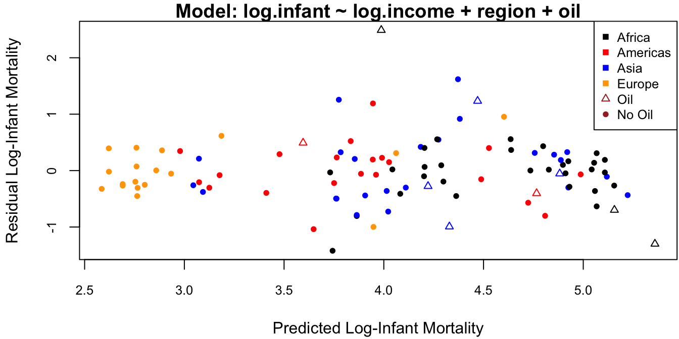
Figure 4.5: Residuals against fitted values for the dataset.
The outlier on this plot is the topmost triangle, which corresponds to Saudi Arabia. It is not clear why Saudia Arabia has a much higher infant mortality rate than predicted by the model. One possibility is that its oil production is so high as to skew the average income. In this case we have the following options:
- Exclude Saudi Arabia from the analysis and admit that we don’t exactly know why (not recommended).
- Exclude all 9 oil producing countries from the analysis and state that our predictions are for non-oil producing countries only.
- Leave Saudi Arabia in and assess how this impacts our analysis.
This last item is the topic of the following sections.
4.3.1 Leverage of an Observation
Consider a linear model \(y \sim \N(X\beta, \sigma^2 I)\). Then we may decompose the predicted value of the \(i\)th observation \(\hat y_i = x_i'\hat \beta\) as \[ \hat y_i = x_i'\hat \beta = x_i'\ixtx X y = h_i y_i + \sum_{j\neq i} h_{ij} y_j, \] where \(h_i = x_i'\ixtx x_i\) and \(h_{ij} = x_i'\ixtx x_j\) are the diagonal and off-diagonal elements of the Hat matrix \(H = X\ixtx X'\). Thus, the \(i\)th predicted value \(\hat y_i\) is a linear combination of the responses with weights determined by the \(i\)th row of the Hat matrix \(H = X\ixtx X'\).
Now, recall that the \(i\)th residual is distributed as \[ e_i = y_i - \hat y_i \sim \N\Big(0, \sigma^2[1-h_{i}]\Big). \] Therefore, as \(h_{i}\) approaches 1, the variance of the \(i\)th residual gets closer and closer to zero. In other words, when \(h_{i} \approx 1\) the \(i\) prediction \(\hat y_i\) must be very close to \(y_i\). This means that the entire prediction surface \(\hat y(x) = x'\hat \beta\) must pass very close to the point \((x_i, y_i)\). For this reason, \(h_{i}\) is called the leverage of observation \(i\).
4.3.1.1 Geometric Interpretation
Note that the leverage \(h_{i} = x_i'\ixtx x_i\) does not depend on the response vector \(y\). It can be interpreted as a measure of the distance between an observation and the centroid of the design matrix \(X_{n\times p}\). To see this, first assume that the columns of \(X\) are centered, i.e., each has mean zero: \(\bar x_j = \tfrac 1 n \sumi 1 n x_{ij} = 0\). Thus, the centroid of \(X\) is just the \(p\)-dimensional zero vector. Next, note that the sample covariance matrix of the centered matrix \(X\) is \[ \cov(X) = \frac 1 {n-1} \left[\sumi 1 n (x_{ij} - \bar x_j)(x_{ik} - \bar x_k) \right]_{1\le j,k \le p} = \frac 1 {n-1} \left[ \sumi 1 n x_{ij}x_{ik} \right] = \frac {X'X}{n-1}. \]
If two observations \(i\) and \(j\) have the same leverage \(h_i = h_j = C\), then the corresponding covariate vectors \(x_i\) and \(x_j\) are in the set \[ \mathcal H = \{x \in \mathbb R^p: x'\ixtx x = C\}. \] In arbitrary dimensions, \(\mathcal H\) represents the level sets of the PDF of the normal distribution \(\N(0, X'X)\). In two or three dimensions (\(p = 2,3\)), it turns out that the set \(\mathcal H\) corresponds to an ellipse centered at the zero vector. This is illustrated in Figure 4.6, for \(n = 100\) and \(p = 2\).
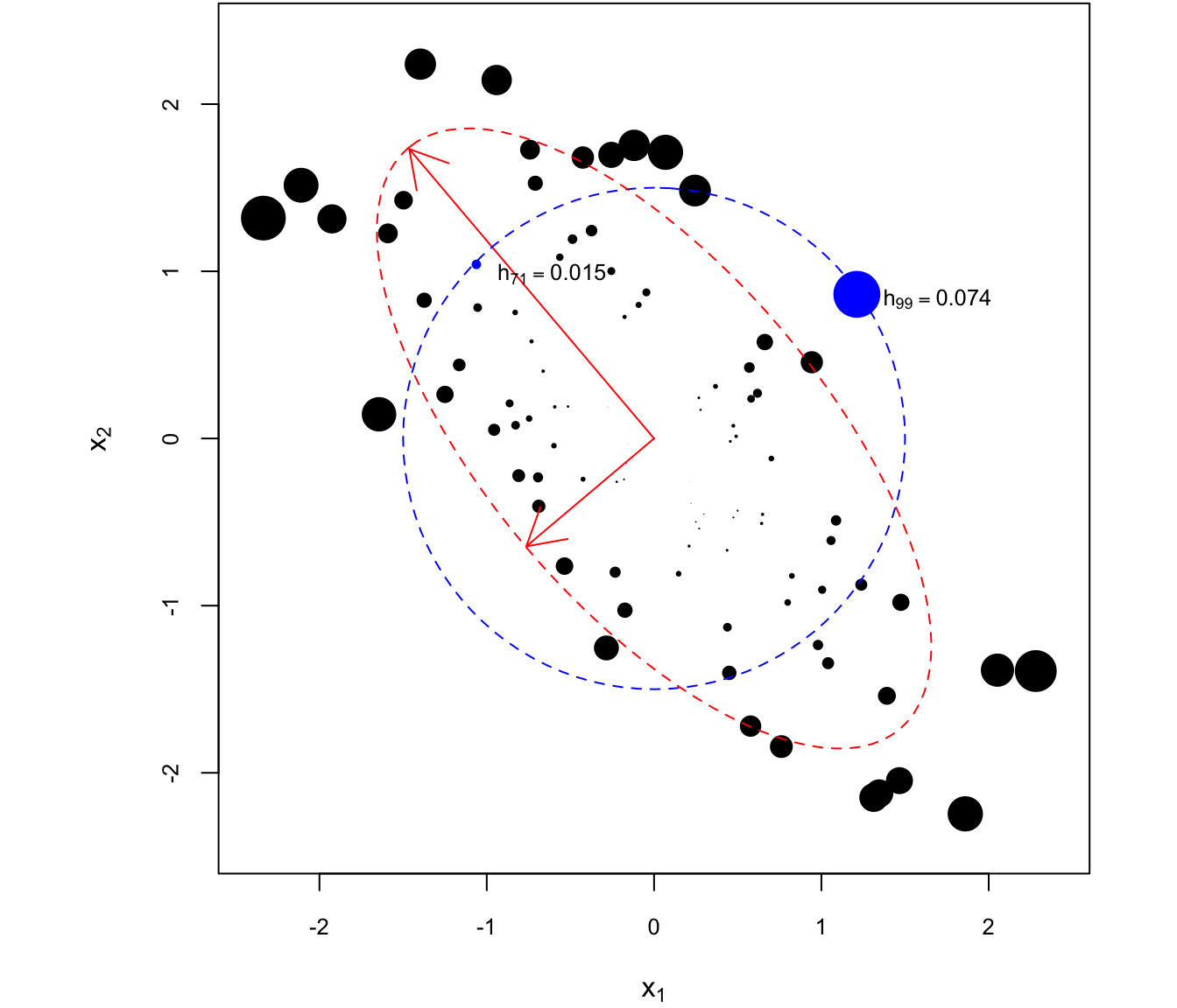
Figure 4.6: Leverage of different observations with two covariates \(x_1\) and \(x_2\). Observations with equal leverage lie on concentric ellipses to the one plotted in red, which is along the sample covariance matrix.
The size of each point is proportional to the levarage of the corresponding observation. In particular, observations 71 and 99 are equidistant from the centroid of the data (in this case, the zero vector). However, \(x_{99}\) is about six times “further” than \(x_{71}\) from the centroid in terms of the distance metric defined by \(\cov(X)\), for which equidistant points lie on ellipses concentric to the one plotted in red.
The principal axes of the ellipse are obtained from the eigendecomposition of \(X'X\). Indeed, if \(X'X = \Gamma'D\Gamma\) with \(\Gamma'\Gamma = I\) and \(D = \diag(\rv \lambda p)\), then \(\ixtx = \Gamma' D^{-1} \Gamma\), and letting \(\tilde x_i = \Gamma x_i\), we have \[ h_{i} = x_i' \ixtx x_i = x_i' \Gamma' D^{-1} \Gamma x_i = \tilde x_i' D^{-1} \tilde x_i = \sum_{j=1}^p \tilde x_{ij}^2/\lambda_j, \] such that \[ \mathcal H = \{x = \Gamma' \tilde x: \sum_{j=1}^p \tilde x_j^2/\lambda_j = C\} \] is the ellipse equation in standard form. Thus, the long red arrow is along \(\Gamma'\left[\begin{smallmatrix} 1 \\ 0\end{smallmatrix}\right] = (\Gamma_{11}, \Gamma_{21})\) an the short arrow is along \(\Gamma'\left[\begin{smallmatrix} 0 \\ 1\end{smallmatrix}\right] =(\Gamma_{21}, \Gamma_{22})\). The two arrows are perpendicular to each other, and the ratio of their lengths is \(\sqrt{\lambda_1/\lambda_2}\).
The developments assumed that the columns of \(X\) were centered. We can, however, relax this assumption if the first column of \(X_{n\times (p+1)}\) contains this intercept. This is because for any invertible matrix \(A_{(p+1)\times (p+1)}\), consider the covariate transformation \(\tilde x_i = A' x_i\), such that the new design matrix is \(\tilde X = XA\). Then the leverage of observation \(i\) on the transformed scale is \[ \tilde h_i = \tilde x_i'(\tilde X' \tilde X)^{-1} \tilde x_i = x_i'A (A'X'XA)^{-1} A' x_i = x_i'AA^{-1}\ixtx [A']^{-1}A' x_i = x_i'\ixtx x_i = h_i. \] In other words, leverage is invariant to invertible linear covariate transformations. In particular, for \(x_i = (1, \rv [i1] x {ip})\), consider the transformation \[ \tilde x_i = \begin{bmatrix} 1 \\ x_{i1} - \bar x_1 \\ \vdots \\ x_{ip} - \bar x_p\end{bmatrix} = \underbrace{\begin{bmatrix} 1 & 0 & \cdots & 0 \\ - \bar x_1 & 1 & \cdots & 0 \\ \vdots & \vdots & & \vdots \\ -\bar x_p & 0 & \cdots & 1 \end{bmatrix}}_{A'} x_i. \] Showing that this transformation is invertible is left as an exercise, but the point is that we can subtract the mean of every column of \(X\) (except) the intercept without affecting the leverage, thus retaining its interpretation as the covariance-weighted distance of an observation from the centroid.
If the design matrix is \(X_{n\times p}\), then the average leverage is \(\bar h = p/n\). This is because \(\sum_{i=1}^n h_{i} = \tr(H) = p\) as we found in the derivation of the chi-square distribution of \(e'e\). Leverage values which are twice the average values are considered to be high.
4.3.2 Influential Observations
As mentioned in the introduction to this chapter, it is generally not a good idea to delete outlying observations simply because that would make residual plots look nicer. Typically, outliers are an indication that an important predictor is missing from the model. If it is possible to fit a better model, that should be done. Otherwise, one might wish to understand what is the impact of excluding a particular observation. In this section, we shall see three measures of this impact which all revolve around comparing \(\hat \beta\) to \(\hat \beta\lp i\), where \(\hat \beta\lp i\) is the MLE with observation \(i\) removed. That is, if \[ y\lp i = \begin{bmatrix} y_1 \\ \vdots \\ y_{i-1} \\ y_{i+1} \\ \vdots \\ y_{n} \end{bmatrix}, \qquad X\lp i = \begin{bmatrix} x_{11} & \cdots & x_{1p} \\ \vdots & & \vdots \\ x_{i-1,1} &\cdots &x_{i-1,p} \\ x_{i+1,1} & \cdots & x_{i+1,p} \\ \vdots & & \vdots \\ x_{n1} & \cdots & x_{np} \end{bmatrix}, \] then \(\hat \beta\lp i = (X'\lp i X\lp i)^{-1} X'\lp i y\lp i\). At first it would seem that a new regression need to be fit in order to calculate each \(\hat \beta \lp i\) for \(1 \le i \le n\). However, it turns out that \[ \hat \beta - \hat \beta\lp i = \frac{e_i}{1-h_{i}} \ixtx x_i. \] Therefore, all of the \(\hat \beta \lp i\) can be easily computed from a single regression using the residual \(e_i\) and the leverage \(h_{i}\). Hinging on this calculation, we have the following popular measures of an observation’s influence on the regression analysis:
Cook’s \(D\) statistic:
\[ D_i = \frac{1}{p} \times \frac{(\hat y - \hat y \lp i)'(\hat y - \hat y \lp i)}{\hat \sigma^2} = \frac 1 p \times \frac{\sum_{j=1}^n (\hat y_j - \hat y_{(i),j})^2}{\hat \sigma^2}, \]
where \(\hat y_j = x_j' \hat \beta\) is the prediction for the \(j\)th observation calculated from all the data and \(\hat y_{(i),j} = x_j' \hat \beta\lp i\) is the prediction for the \(j\)th observation calculated with the \(i\)th observation removed. Thus, \(D_i\) is a measure of the change in the sum-of-squared difference between the predictions from all the data and the predictions without observation \(i\). It turns out that
\[\begin{align*} D_i & = \frac 1 p \times (\hat \beta - \hat \beta\lp i)'[\hat \sigma^2\ixtx]^{-1}(\hat \beta - \hat \beta \lp i) \\ & = \frac 1 p \times \frac{h_{i}e_i^2}{\hat \sigma^2 (1-h_{i})^2}. \end{align*}\]
PRESS statistic:
\[ \tx{PRESS}_i = y_i - \hat y_{(i),i} = y_i - x_i' \hat \beta\lp i = \frac{e_i}{1-h_{i}}. \]
While a large magnitude for the residual \(e_i = y_i - \hat y_i\) is a natural measure for detecting the presence of an outlier, note that high-leverage observations for \(\hat y_i\) to pass very close to \(y_i\). Therefore, an outlier with high leverage might not register an enormous residual. On the other hand, if residuals are computed by comparing \(y_i\) to a prediction that excludes observation \(i\), then a high-leverage outlier is more readily detected, as illustred in Figure 4.7.
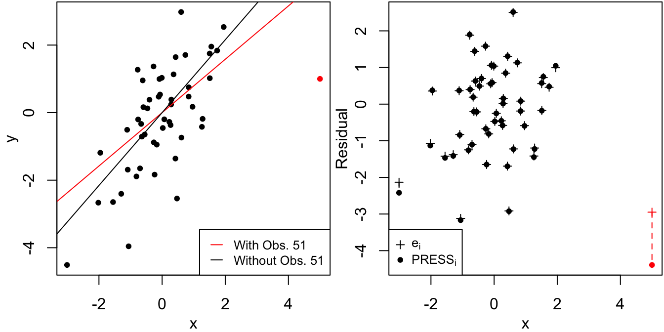
Figure 4.7: Residual and PRESS residual for a high leverage observation.
DFFITS residuals: Instead of comparing the “leave-one-out” prediction \(\hat y_{(i),i)}\) to the actual observation \(y_i\), we can instead consider the difference between predicted values for \(y_i\):
\[ \hat y_i - \hat y_{(i),i} = (\underbrace{y_i - \hat y_{(i),i}}_{\tx{PRESS}_i}) - (\underbrace{y_i - \hat y_i}_{e_i}) = \frac{h_{i}}{1-h_{i}} e_i. \]
The DFFITS (DiFference in FITS) residuals are a standardized version of the above:
\[ \tx{DFFITS}_i = \frac{\hat y_i - \hat y\lp i}{\hat \sigma\lp i \sqrt{h_{i}}} = \frac{\sqrt{h_{i}}}{\hat\sigma\lp i (1-h_{i})} e_i, \]
where
\[ \hat \sigma^2\lp i = \frac{\sum_{j\neq i}(y_j - x_j'\hat\beta\lp i)^2}{(n-1)-p} = \frac{(n-p)\hat\sigma^2 - e_i^2/(1-h_{i})}{(n-1)-p}. \]
The standardization is to make the DFFITS residuals essentially correspond to the square-root of Cook’s influence statistic (up to a factor of \(p^{1/2}\cdot\hat \sigma / \hat \sigma\lp i\)).
4.3.3 Illustration
The dataset forestry.txt contains the following variables on 35 coniferous trees:
NeedleArea: Area of shade produced by the tree’s needles.Height: Height of the tree.TrunkSize: Diameter of the tree.
The following model is fit to the data:
forest <- read.csv("forestry.txt", sep = "\t", header = TRUE, skip = 1)
lforest <- log(forest) # logs of all variables
M <- lm(NeedleArea ~ Height + TrunkSize, data = lforest) # linear model on log scale
Msum <- summary(M)
Figure 4.8 displays the residuals vs. fitted values using four types of residuals: standardized, studentized, PRESS, and DFFITS. As these are all on completely different scales, they are first multiplied by a constant factor such that all residuals would have the same value at the average leverage, \(\bar h = p/n\).
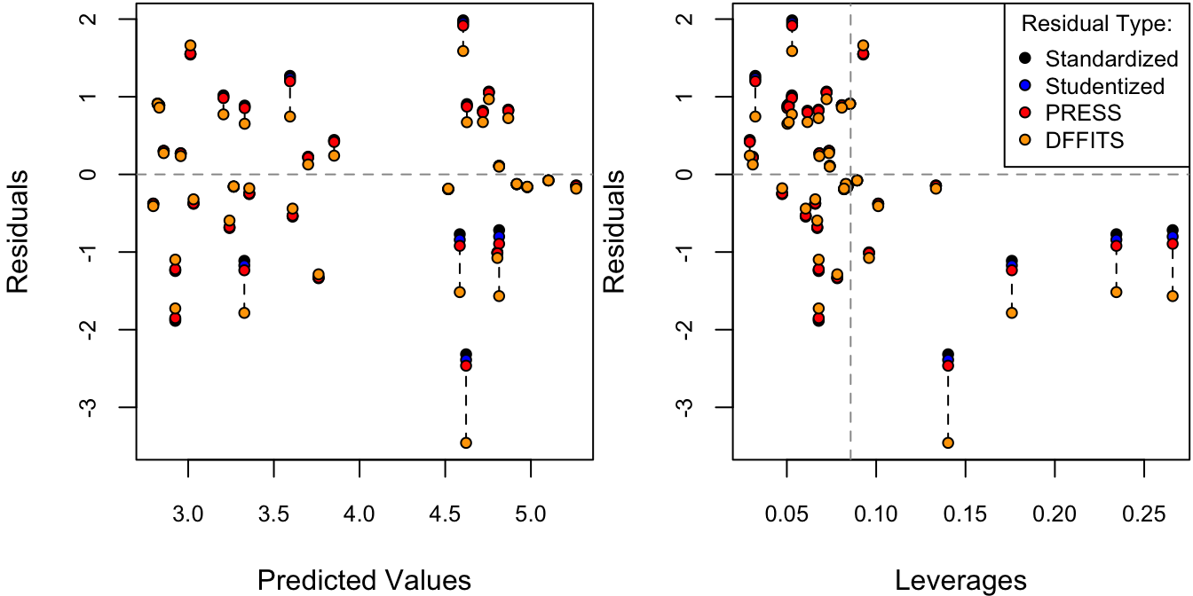
Figure 4.8: Residuals against fitted values. The different types of residuals have been standardized such that each of them are identical at the average leverage value, \(\bar h = p/n\).
Out of these four types of residuals, each amplifies the large residuals more and more. To measure the overall influence of each observation, Cook’s distance is plotted against leverage in Figure 4.9.
# cook's distance vs. leverage
D <- cooks.distance(M)
# flag some of the points
infl.ind <- which.max(D) # top influence point
lev.ind <- h > 2*hbar # leverage more than 2x the average
clrs <- rep("black", len = n)
clrs[lev.ind] <- "blue"
clrs[infl.ind] <- "red"
par(mfrow = c(1,1), mar = c(4,4,1,1))
cex <- .8
plot(h, D, xlab = "Leverage", ylab = "Cook's Influence Measure",
     pch = 21, bg = clrs, cex = cex, cex.axis = cex)
p <- length(coef(M))
n <- nrow(lforest)
hbar <- p/n # average leverage
abline(v = 2*hbar, col = "grey60", lty = 2) # 2x average leverage
legend("topleft", legend = c("High Leverage", "High Influence"), pch = 21,
       pt.bg = c("blue", "red"), cex = cex, pt.cex = cex)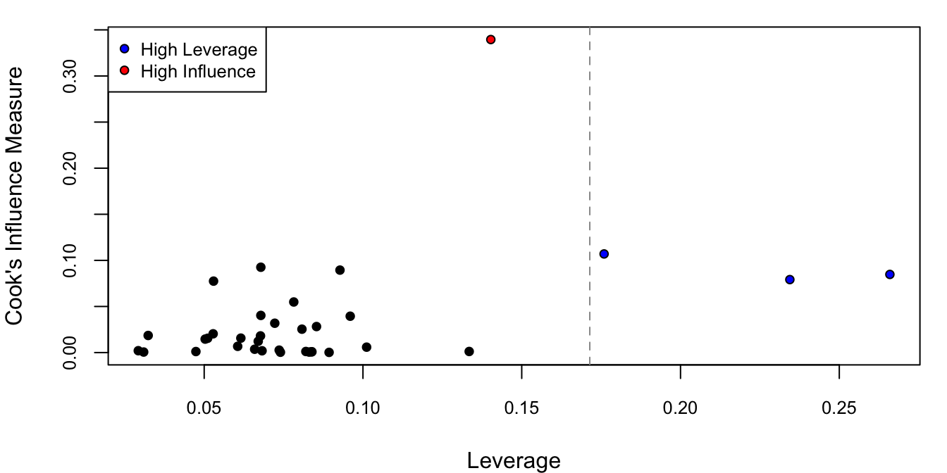
Figure 4.9: Cook’s distance against leverage.
One of the observations has almost more than 3 times the Cook’s distance of the others (in red) and thee of the observations have twice the average leverage (in blue). To see why the observations have high leverage, we can look at a pairs plot of all the covariates (in this case this is just Height and TrunkSize).
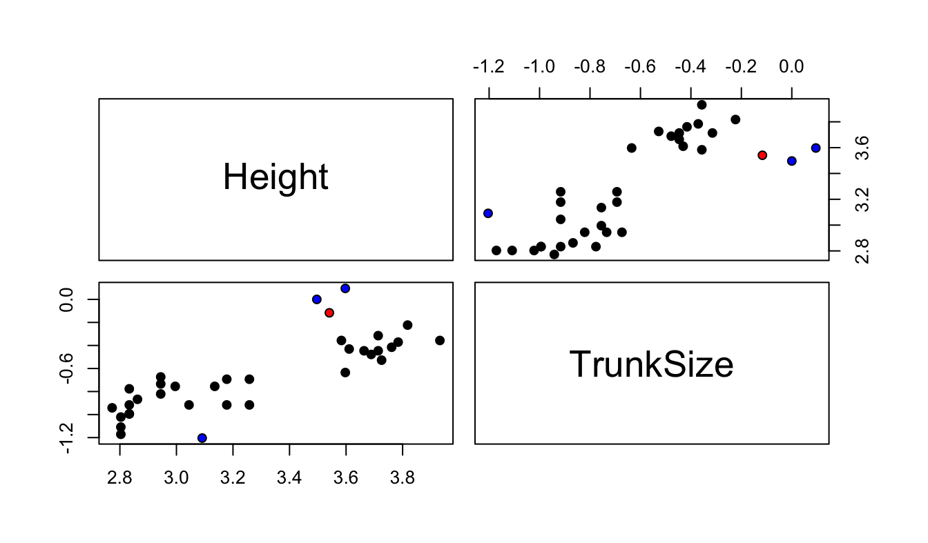
Figure 4.10: Scatterplot between covariates. The high influence points are in red and the high leverage points are in blue.
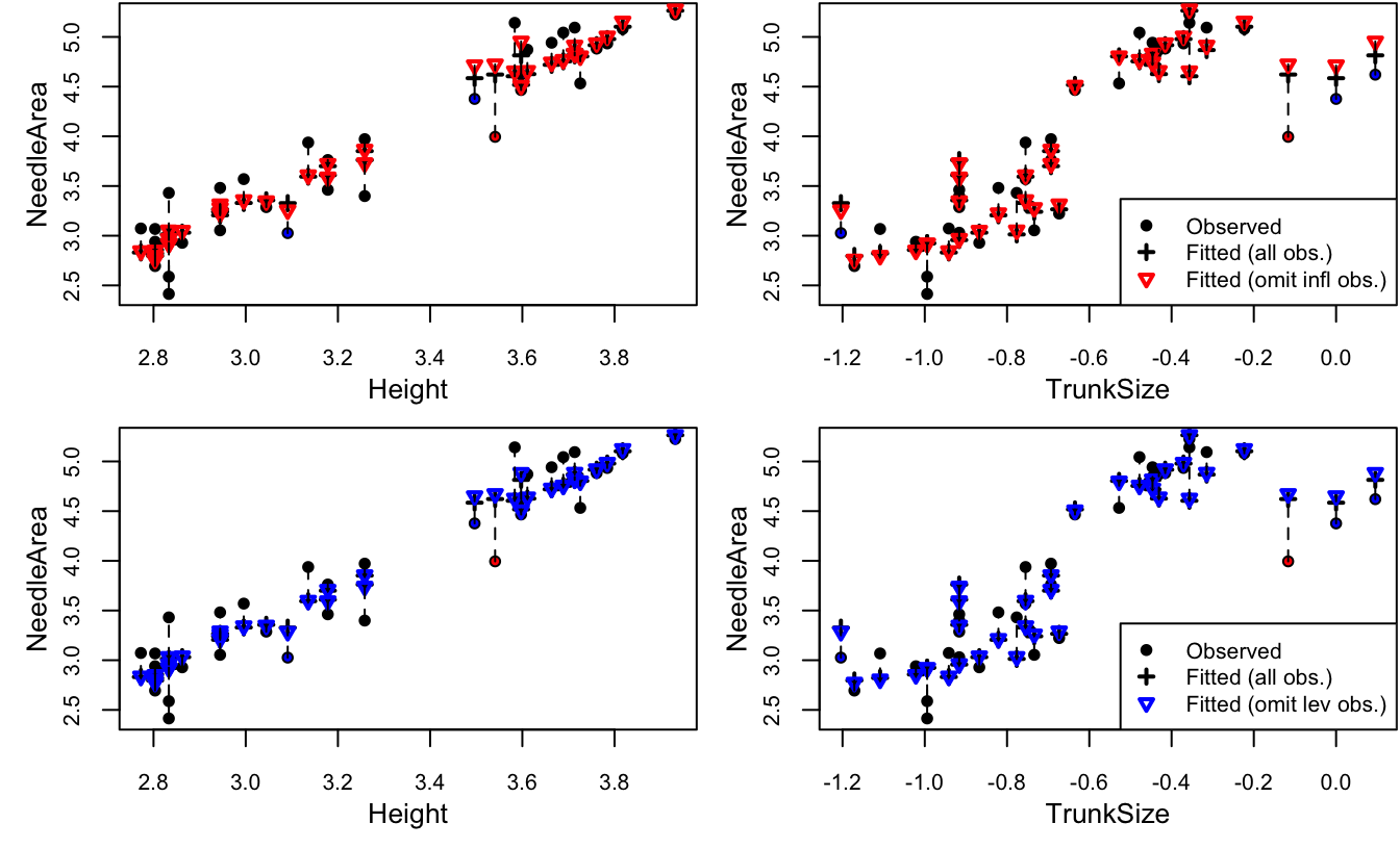
Figure 4.11: Needle area against each covariate. The high influence points are in red and the high leverage points are in blue.
We can see that three of the flagged points (the influential point and two high leverage points) have very large values of TrunkSize (recall that the values are plotted on the log scale). The remaining high leverage point has very small large trunk size relative to its height. As for why only one of the three trees with the largest trunk size is flagged as an outlier, we can plot NeedleArea against each of the covariates including both actual and predicted values. For comparison, Figure 4.11 makes predictions with all observations, and with one observation omitted: either the most influential one, or the one with highest leverage. We can see that the difference between predictions with and without the omitted observation is somewhat more pronounced when the influential observation is removed. This is most apparent in the plots of NeedleArea vs. TrunkSize, for the three points with high leverage and the point with high influence. In this particular case, it was determined that the three trees with the largest trunk size were incorrectly measured and they could safely be removed from the analysis.
\(\R\) code for Figure 4.8:
# residuals vs predicted values
y.hat <- predict(M) # predicted values

sigma.hat <- Msum$sigma
res <- resid(M) # original residuals$
stan.res <- res/sigma.hat # standardized residuals

# compute leverages
X <- model.matrix(M)
H <- X %*% solve(crossprod(X), t(X)) # HAT matrix
head(diag(H))
## 1 2 3 4 5 6
## 0.26592994 0.23442776 0.17593071 0.02924920 0.03094280 0.06055045## [1] -4.524159e-15 -6.938894e-18# studentized residuals
stud.res <- stan.res/sqrt(1-h)
# PRESS residuals
press <- res/(1-h)
# DFFITS residuals
dfts <- dffits(M) # the R way
# standardize each of these such that they are identical at the average leverage value
p <- length(coef(M))
n <- nobs(M)
hbar <- p/n # average leverage
stud.res <- stud.res*sqrt(1-hbar) # at h = hbar, stud.res = stan.res
press <- press*(1-hbar)/sigma.hat # at h = hbar, press = stan.res
dfts <- dfts*(1-hbar)/sqrt(hbar) # at h = hbar, dfts = stan.res
# plot all residuals
par(mfrow = c(1,2), mar = c(4,4,.1,.1))
# against predicted values
cex <- .8
plot(y.hat, rep(0, length(y.hat)), type = "n", # empty plot to get the axis range
ylim = range(stan.res, stud.res, press, dfts), cex.axis = cex,
xlab = "Predicted Values", ylab = "Residuals")
# dotted line connecting each observations residuals for better visibility
segments(x0 = y.hat,
y0 = pmin(stan.res, stud.res, press, dfts),
y1 = pmax(stan.res, stud.res, press, dfts),
lty = 2)
points(y.hat, stan.res, pch = 21, bg = "black", cex = cex)
points(y.hat, stud.res, pch = 21, bg = "blue", cex = cex)
points(y.hat, press, pch = 21, bg = "red", cex = cex)
points(y.hat, dfts, pch = 21, bg = "orange", cex = cex)
abline(h = 0, col = "grey60", lty = 2) # horizontal line
# against leverages
plot(h, rep(0, length(y.hat)), type = "n", cex.axis = cex,
ylim = range(stan.res, stud.res, press, dfts),
xlab = "Leverages", ylab = "Residuals")
segments(x0 = h,
y0 = pmin(stan.res, stud.res, press, dfts),
y1 = pmax(stan.res, stud.res, press, dfts),
lty = 2)
points(h, stan.res, pch = 21, bg = "black", cex = cex)
points(h, stud.res, pch = 21, bg = "blue", cex = cex)
points(h, press, pch = 21, bg = "red", cex = cex)
points(h, dfts, pch = 21, bg = "orange", cex = cex)
abline(v = hbar, col = "grey60", lty = 2)
abline(h = 0, col = "grey60", lty = 2) # horizontal line
legend("topright", legend = c("Standardized", "Studentized", "PRESS", "DFFITS"),
pch = 21, pt.bg = c("black", "blue", "red", "orange"), title = "Residual Type:",
cex = cex, pt.cex = cex,)\(\R\) code for Figure 4.11:
# indices of omitted observations
omit.ind <- c(infl.ind, # most influential
              which.max(h)) # highest leverage
names(omit.ind) <- c("infl", "lev")
omit.ind
## infl lev
## 10 1yobs <- lforest[,"NeedleArea"] # observed values
Mf <- lm(NeedleArea ~ Height + TrunkSize, data = lforest) # all observations
yfitf <- predict(Mf) # fitted values
par(mfrow = c(2,2))
par(mar = c(3.5,3.5,0,0)+.1)
cex <- .8
clrs2 <- c("red", "blue")
for(jj in 1:length(omit.ind)) {
# model with omitted observation
Mo <- lm(NeedleArea ~ Height + TrunkSize,
data = lforest, subset = -omit.ind[jj])
yfito <- predict(Mo, newdata = lforest) # fitted values at all observations
for(ii in c("Height", "TrunkSize")) {
# response vs. each covariate
xobs <- lforest[,ii] # covariate
ylim <- range(yobs, yfitf, yfito) # y-range of plot
# observed
plot(xobs, yobs, pch = 21, bg = clrs, cex = cex, cex.axis = cex,
xlab = "", ylab = "")
title(xlab = ii, ylab = "NeedleArea", line = 2)
# fitted, all observations
points(xobs, yfitf, pch = 3, lwd = 2, cex = cex)
# fitted, one omitted observation
points(xobs, yfito, col = clrs2[jj], pch = 6, lwd = 2, cex = cex)
# connect with lines
segments(x0 = xobs, y0 = pmin(yobs, yfitf, yfito),
y1 = pmax(yobs, yfitf, yfito), lty = 2) # connect them
}
legend("bottomright",
legend = c("Observed", "Fitted (all obs.)",
paste0("Fitted (omit ", names(omit.ind)[jj], " obs.)")),
pch = c(21,3,6), lty = c(NA, NA, NA),
lwd = c(NA, 2, 2), pt.bg = "black",
col = c("black", "black", clrs2[jj]),
cex = cex, pt.cex = cex)
}By Canadian law, any study collecting data from human participants – anything from opinions about the weather to blood samples – must be reviewed by a certified Ethics Board. This study was conducted in 1980. By the standards of the Canadian Human Rights Act, a study conducted in Canada asking for gender as a binary would not receive ethics approval. More information on this topic can be found here.↩︎